
kaiju corp is an "anti-esports esports" community based in the midwest, united states that is at it's core is just a group of people playing video games together, working to improve and enjoy each other's company. I was approached first in june 2021 to make some potential jerseys for kaiju corp, which eventually evolved into a t-shirt. I was contacted again in january 2022 to design a second run of kaiju corp shirts for fundraising and again in april 2022 for a run of hoodies and sweatpants for the fall. this project is the fruit of our collaborations.
all kaiju corp promotional graphics made by sean norton
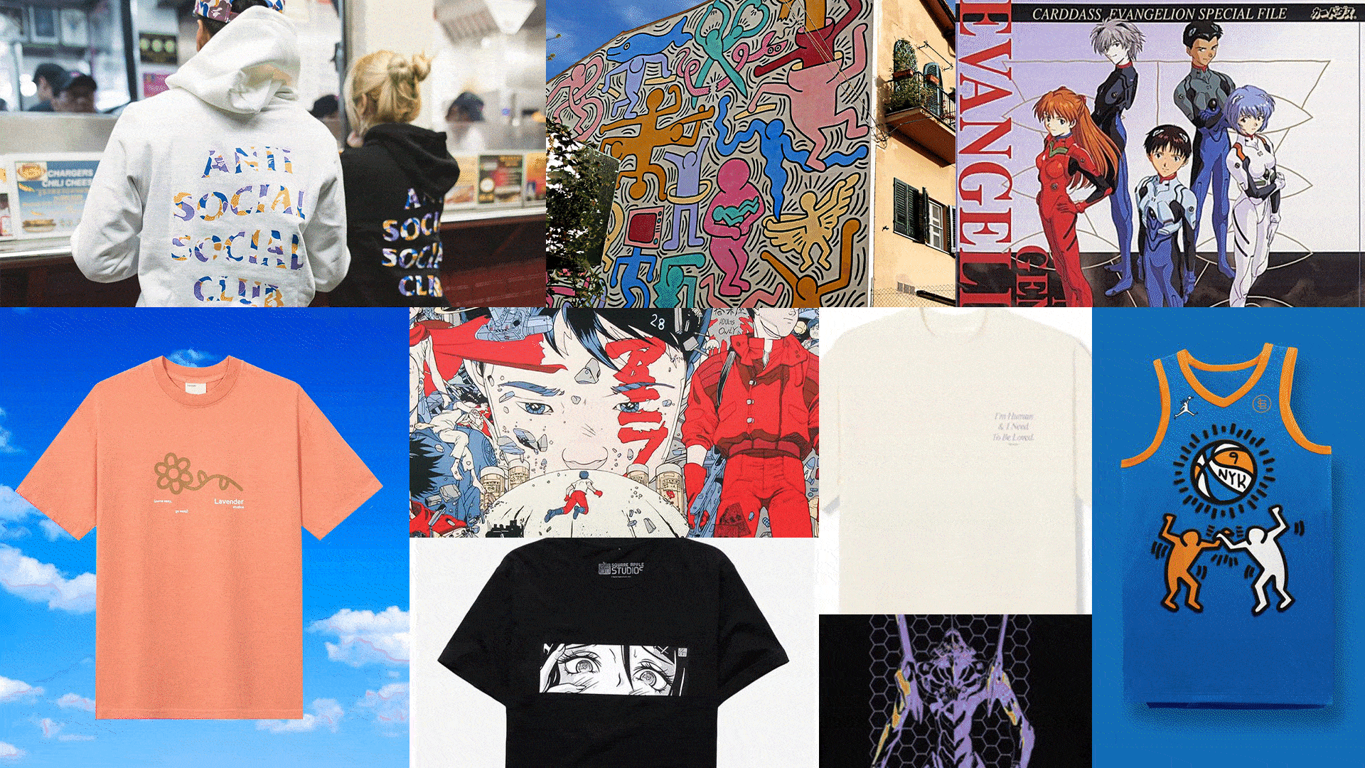
inspiration
the process

the first round of shirts were closely based on the original inspiration. a heavy influence was placed on "soft" and simple pastel vibes. pink was also used to symbolize kaiju corp's main color. after the decision was made to print locally, the designs needed to be simplified to make sure they were within printing capabilities.
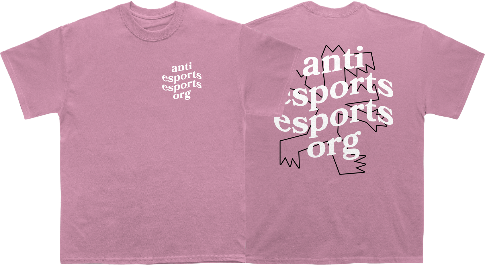
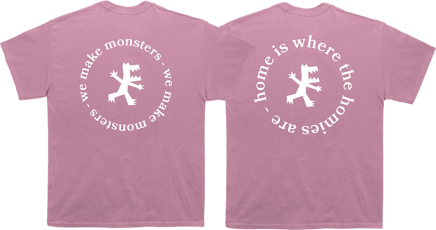
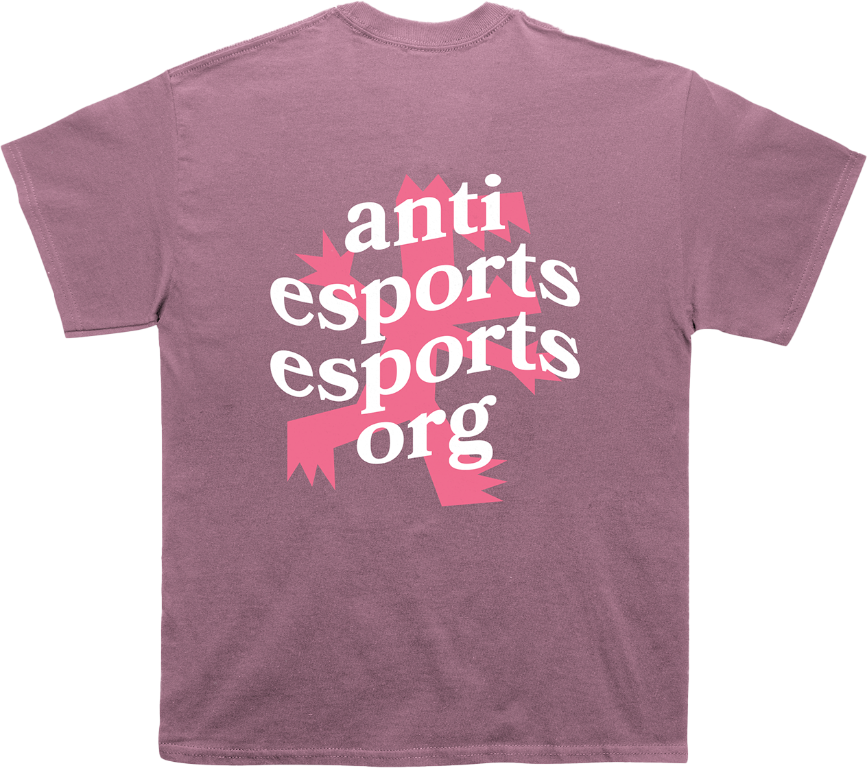
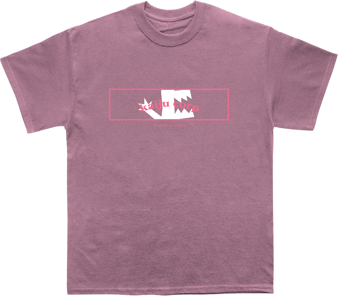
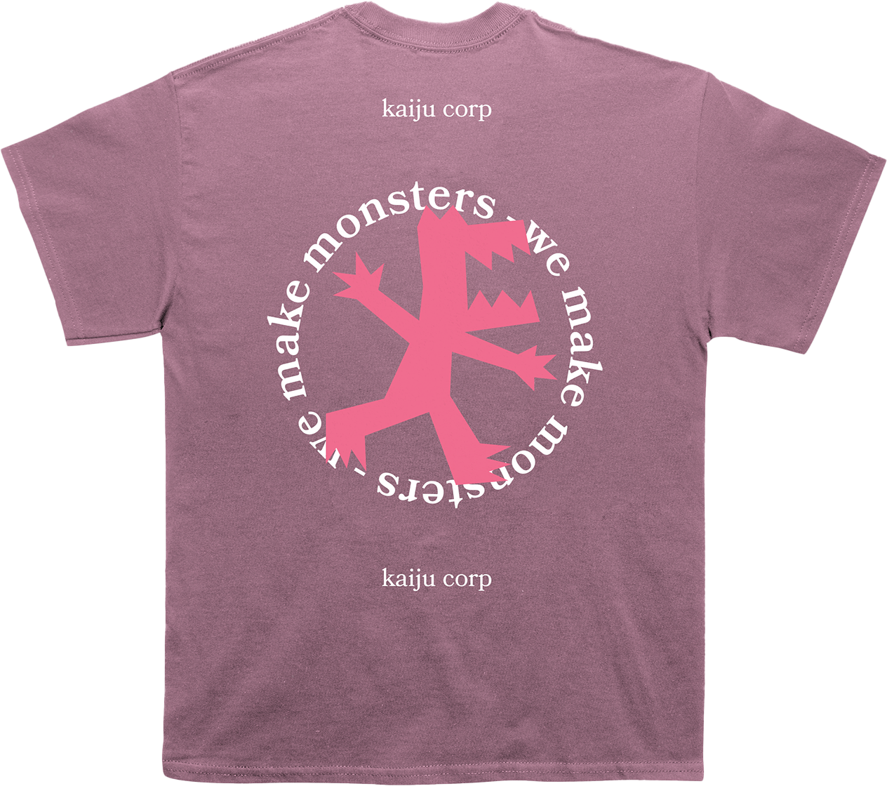
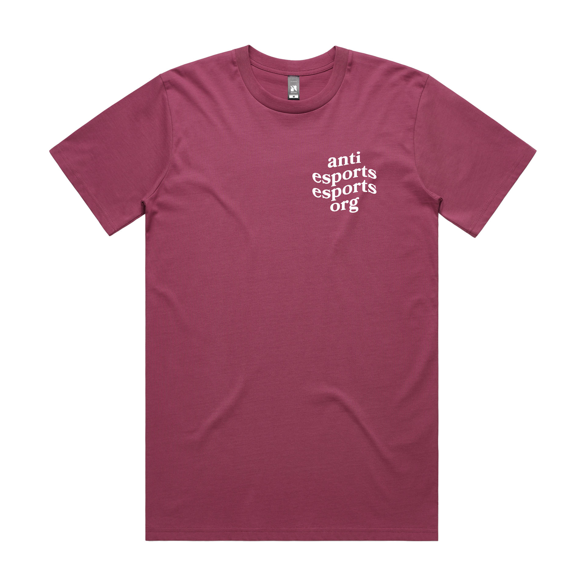
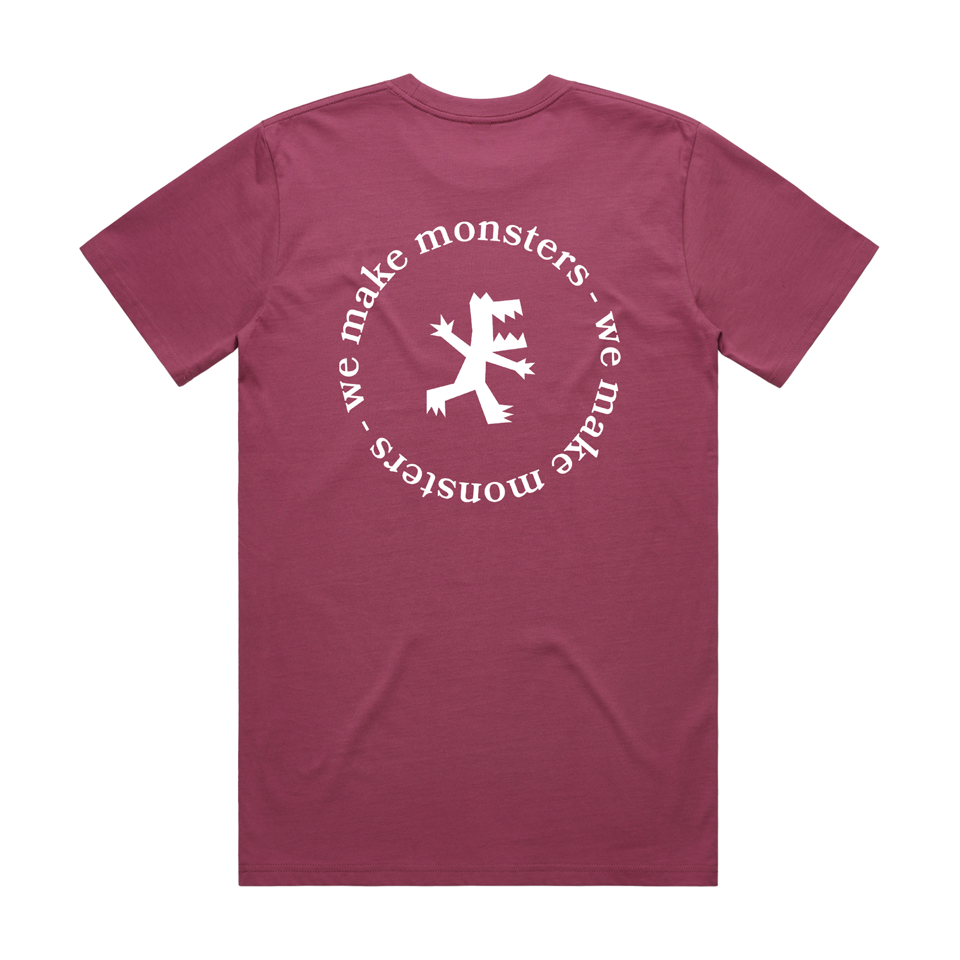
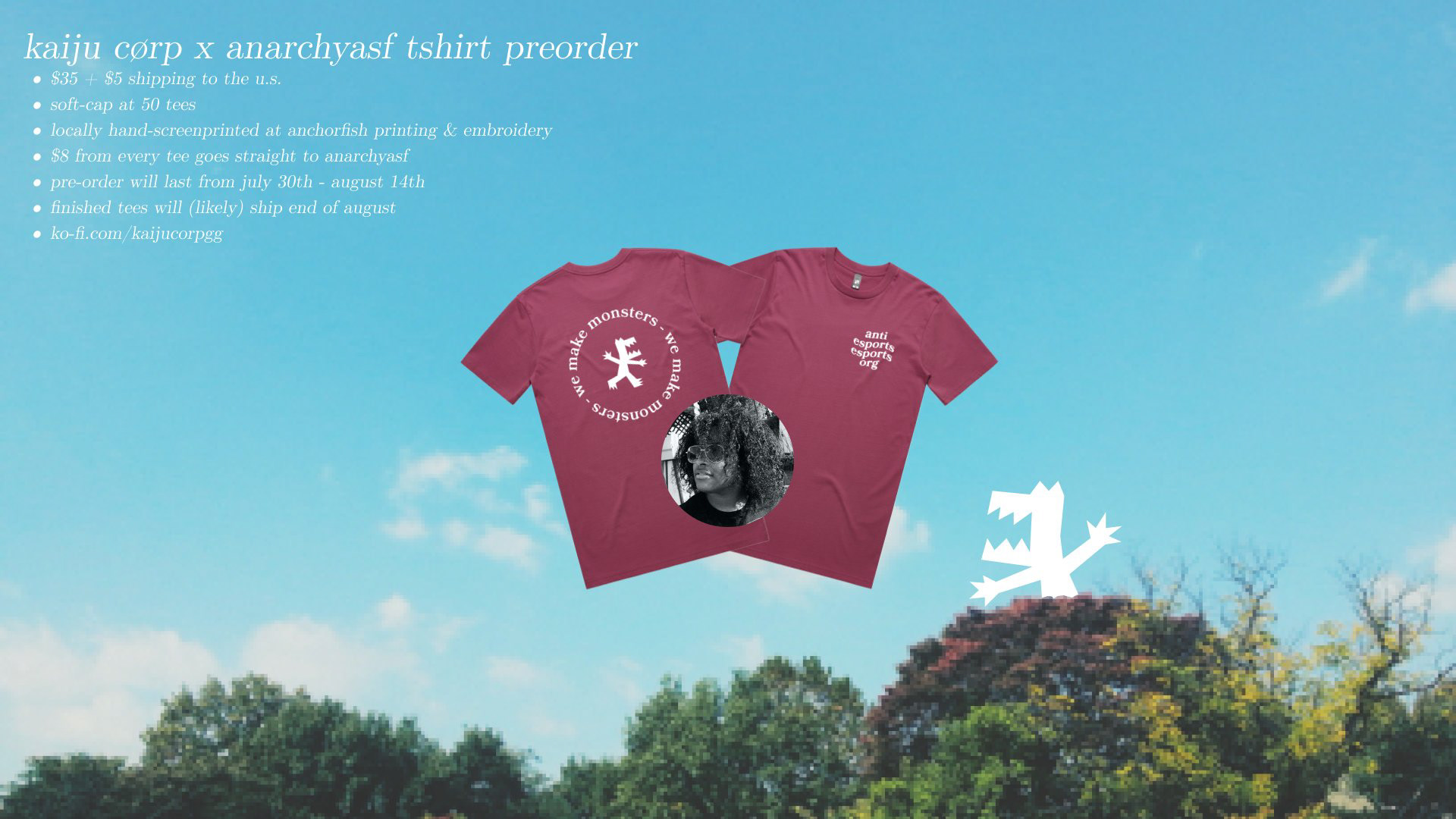
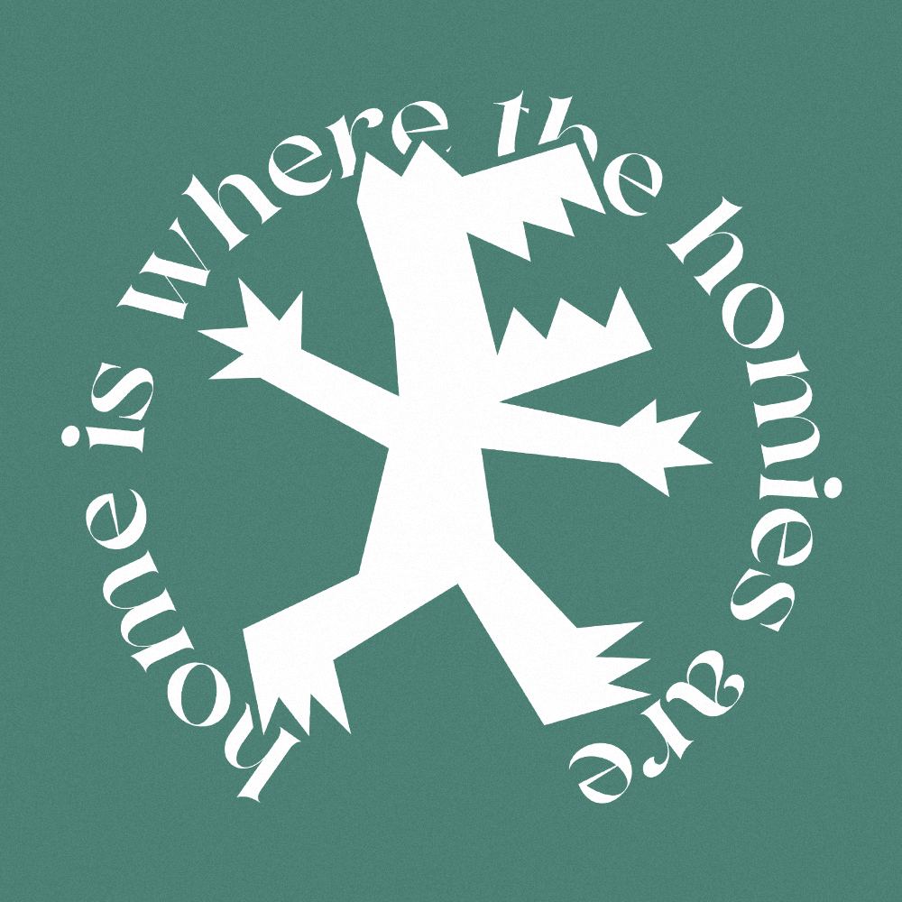
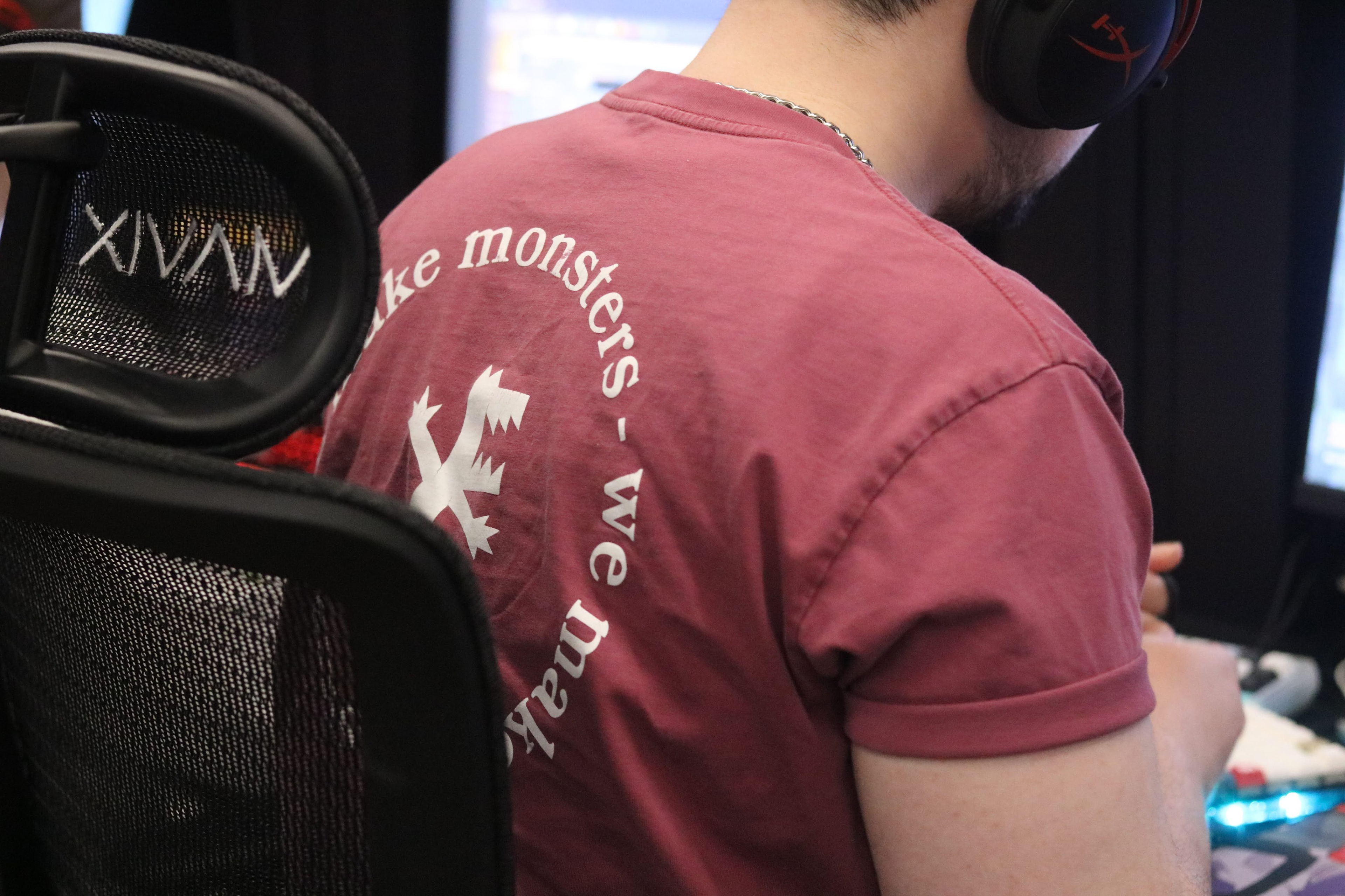
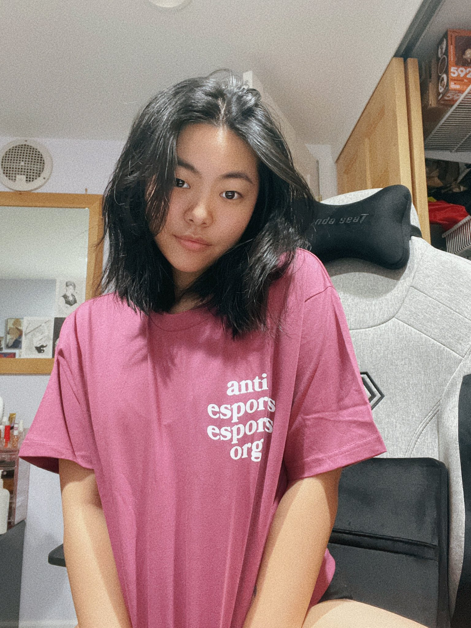
after revising and refining some of the designs from the first round we honed in on the two above designs. for the final shirt these two ideas would be combined, the front being "anti-esports esports org" and the back being the "we make monsters" circular design.
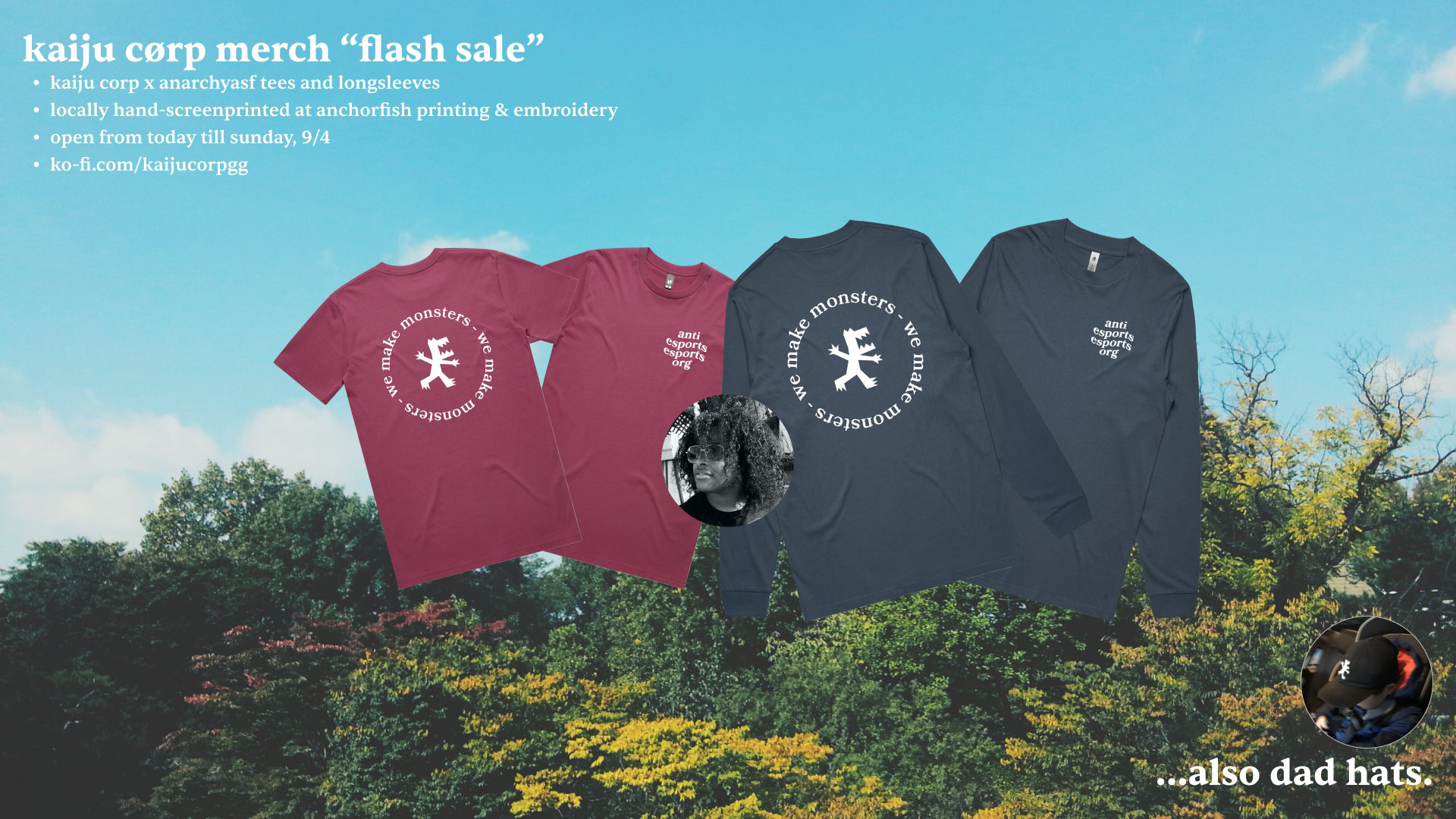
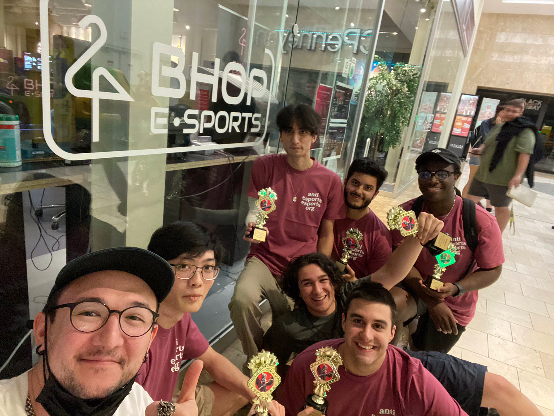
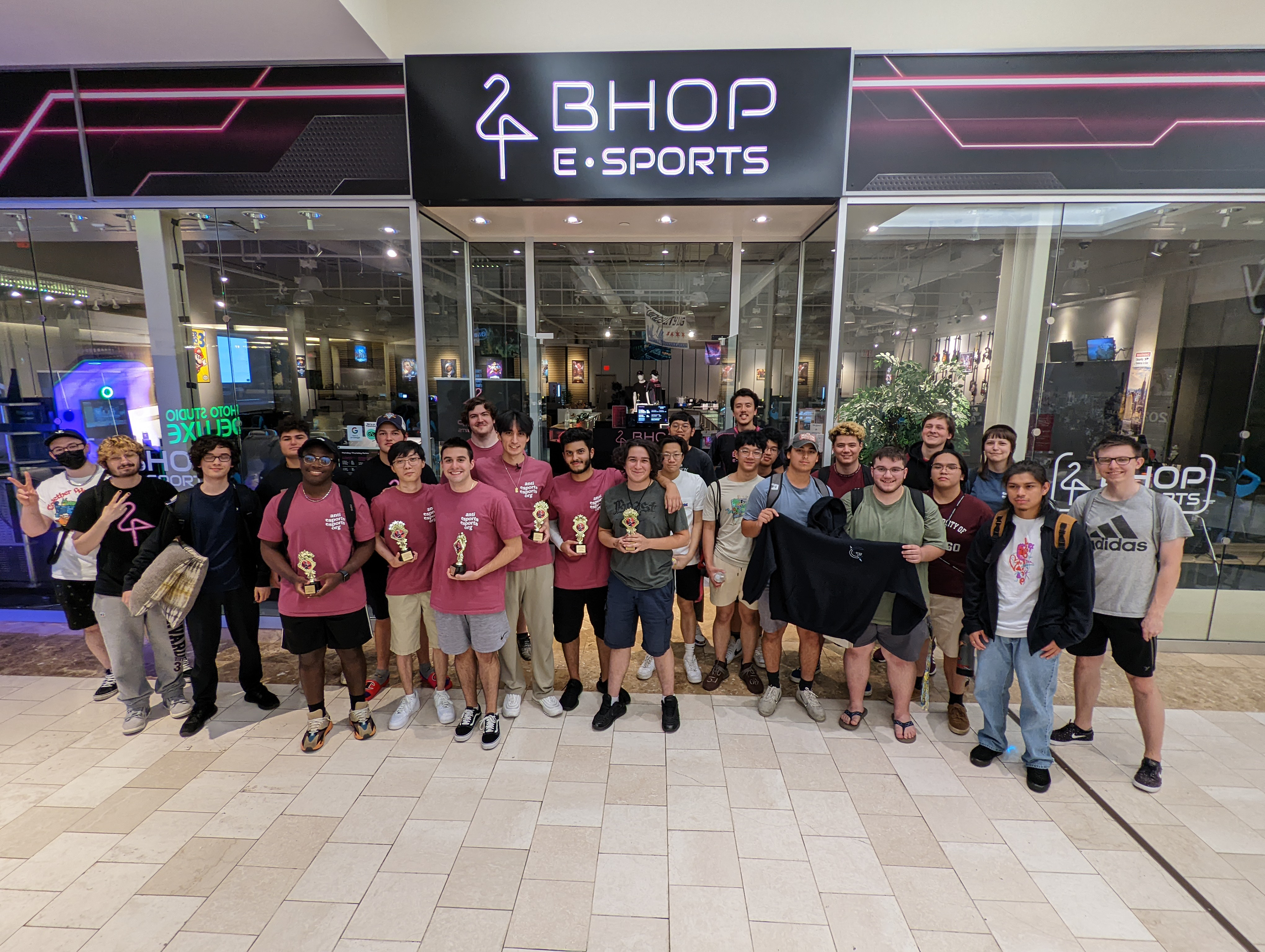
this design has since become a staple design for kaiju corp and been re-released in different colors and on different shirts
final shirt design + promotion
round 2
i was approached once again in january 2022 to help design some more shirts to fundraise for kaiju corp's many endeavors. the idea was to use one of the previous unused designs and elaborate on it.
the process
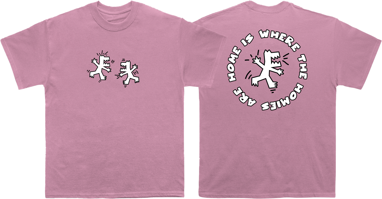
during our first collaboration, I came back with some revision designs that were heavily inspired by artist Keith Haring using my own hand drawn outlines and doodles. while we didn't end up choosing them at the time, we decided to shelve them for later. eventually later came and these were the designs we decided to move forward with this time around.
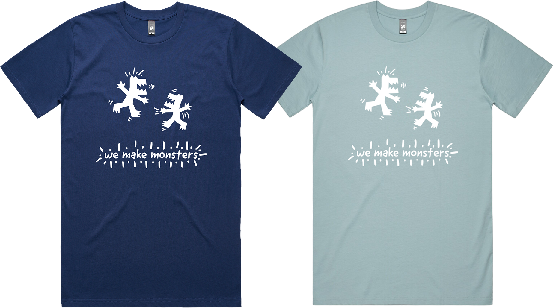
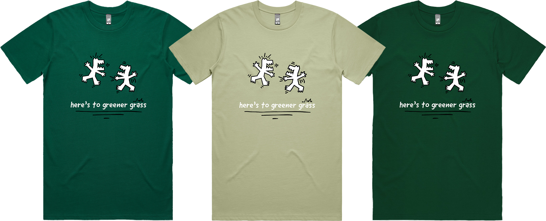
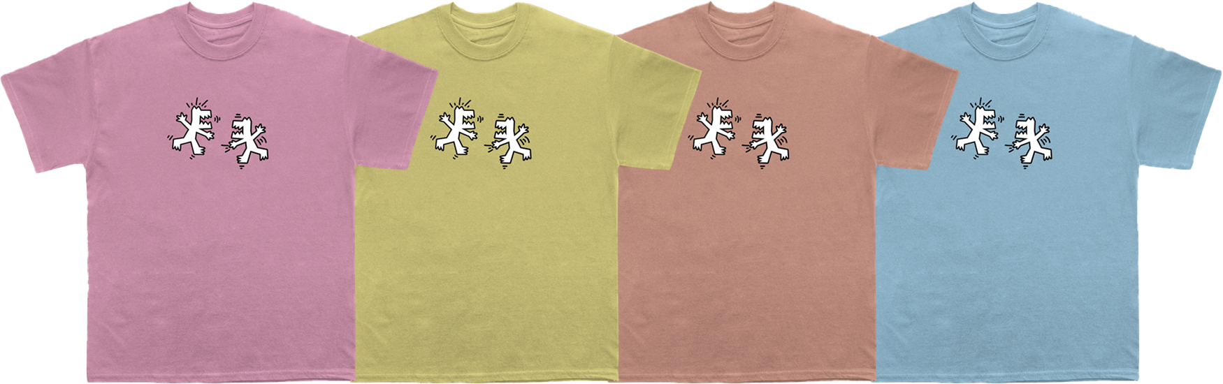
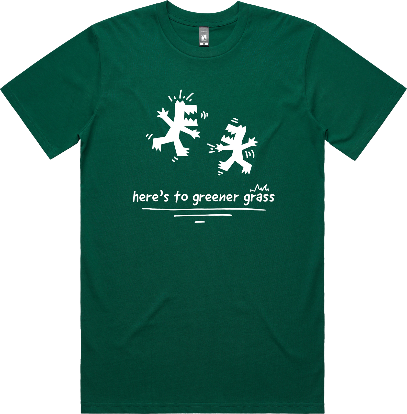
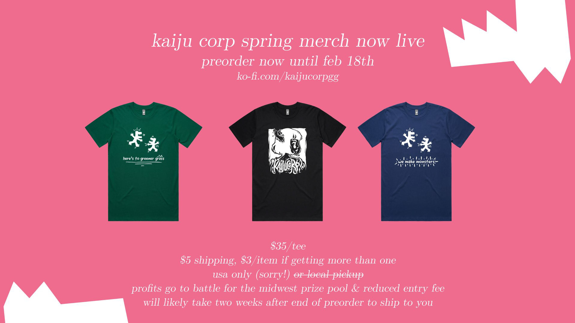
we ended up settling on two different sayings for the shirts that really resonate with kaiju corp. for "here's to greener grass" i chose to experiment with different shades of green shirts. for "we make monsters" i chose to use blue to contrast with it's sibling. eventually the shirts were also revised to use white outlines to make it easier on the local printer. the shirt colors "cobalt blue" and "jade green" were chosen in the end.
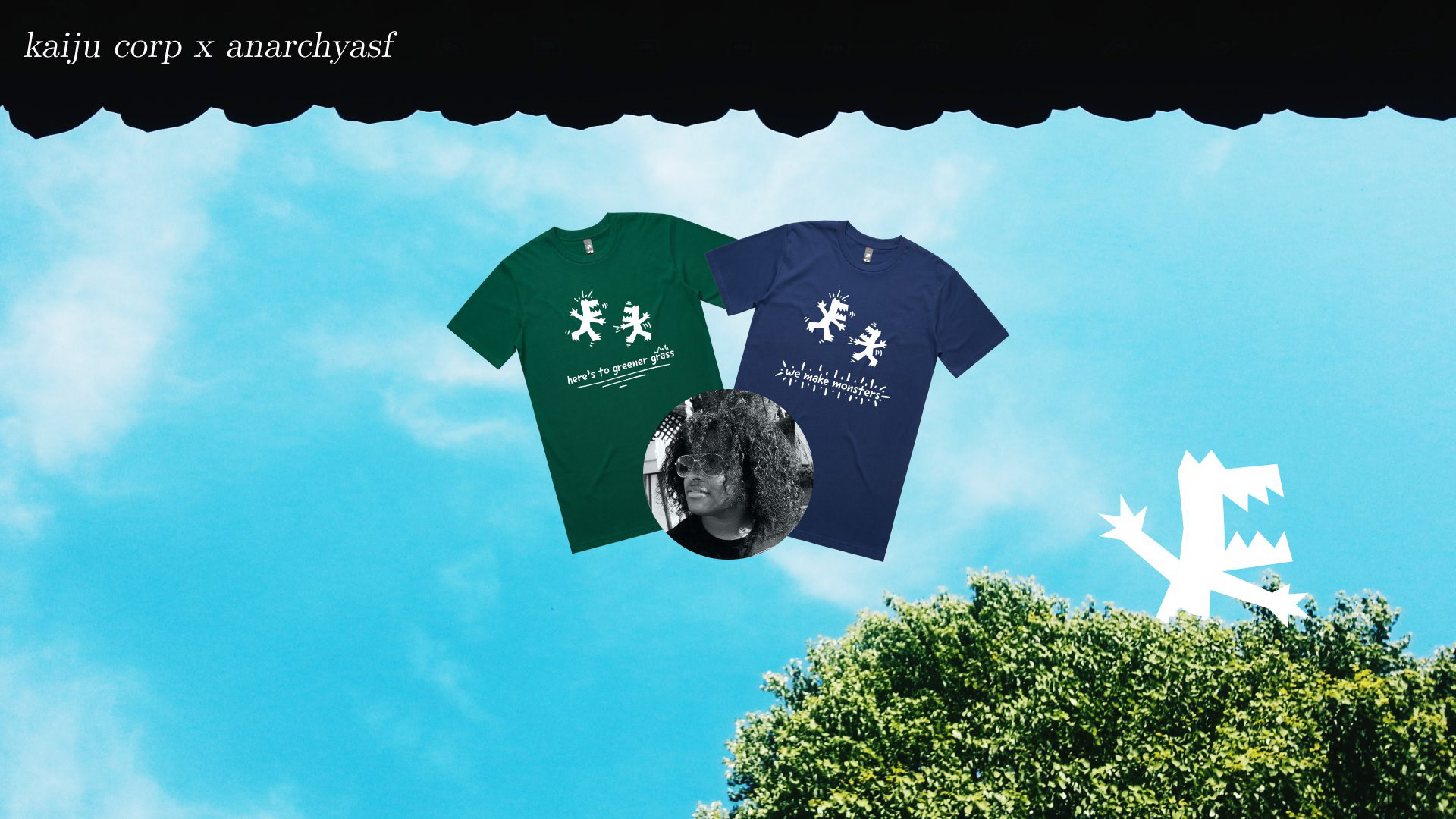
final shirt designs + promotion

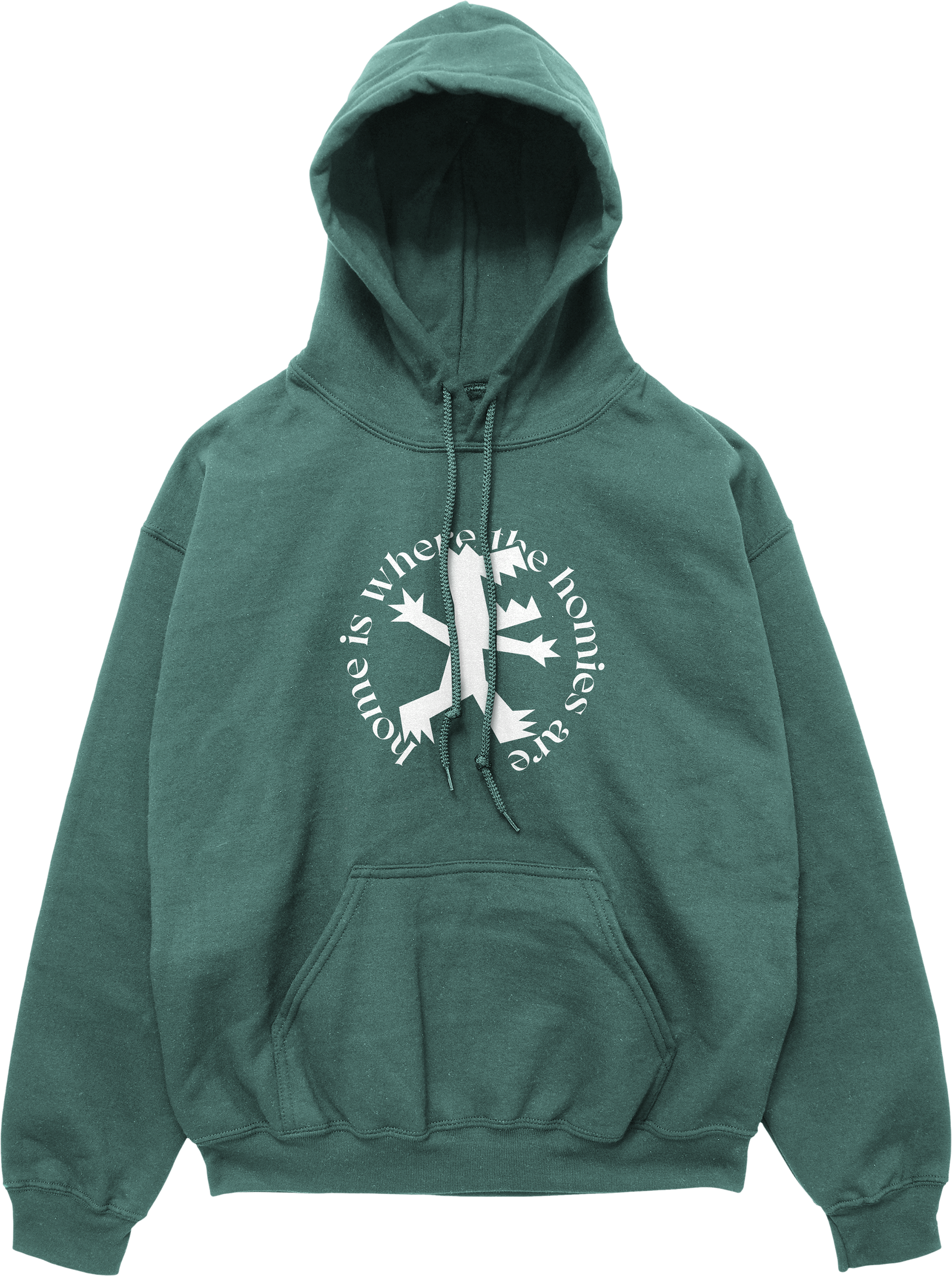
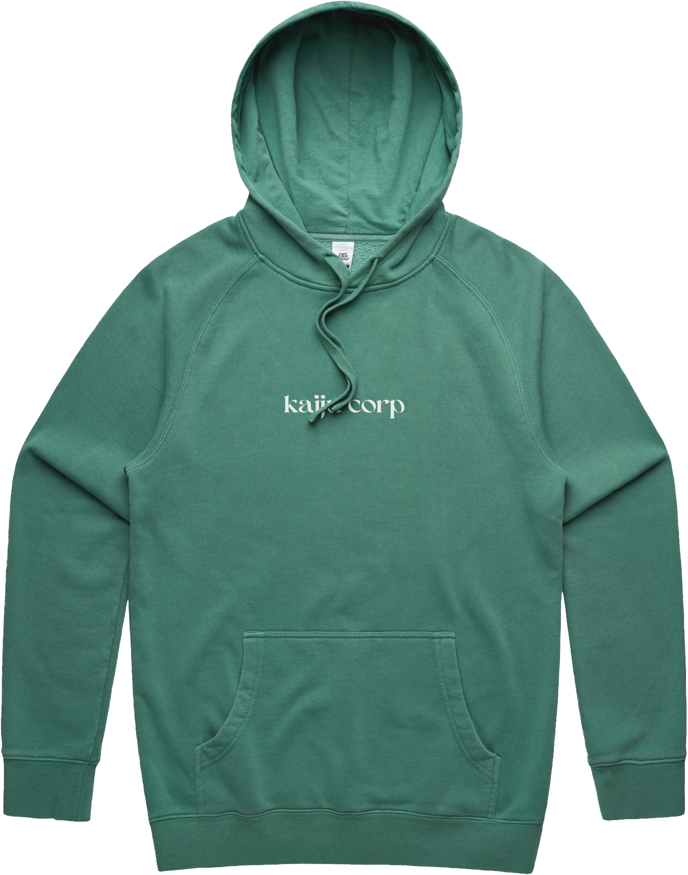
round 3
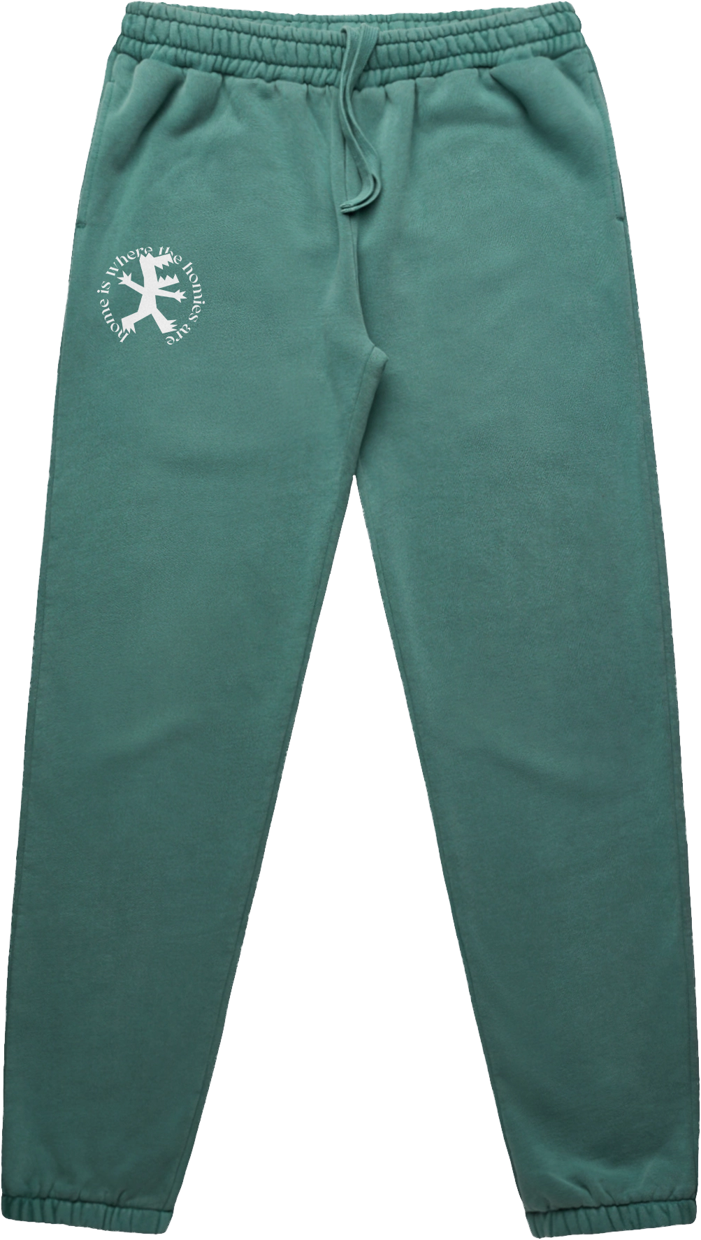
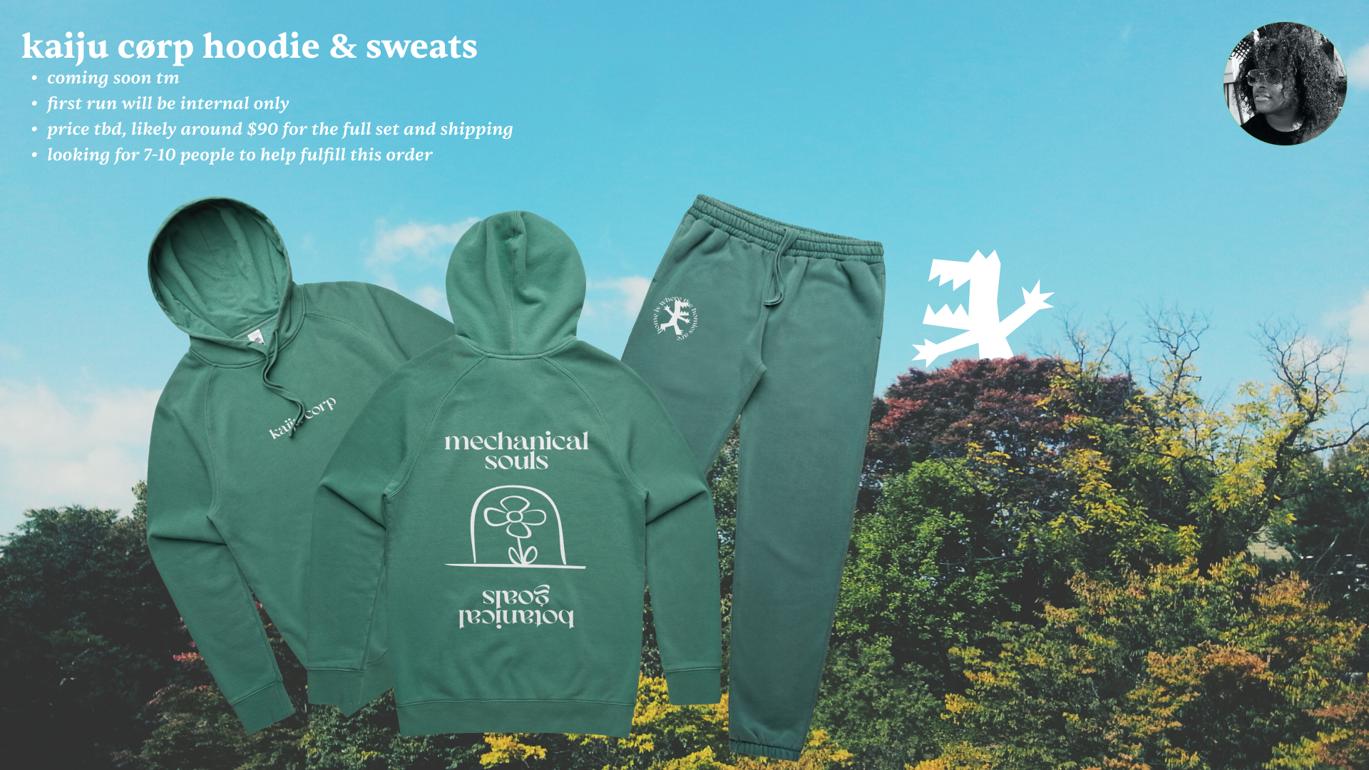
though sean had brought this up beforehand on a couple occasions, in april 2022 i was approached to design a hoodie and sweatpant set to release for this upcoming fall.

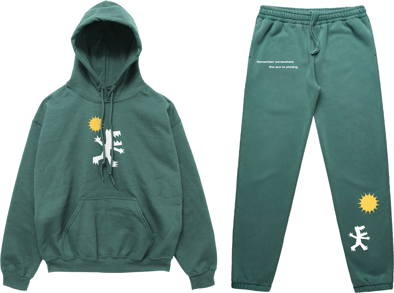
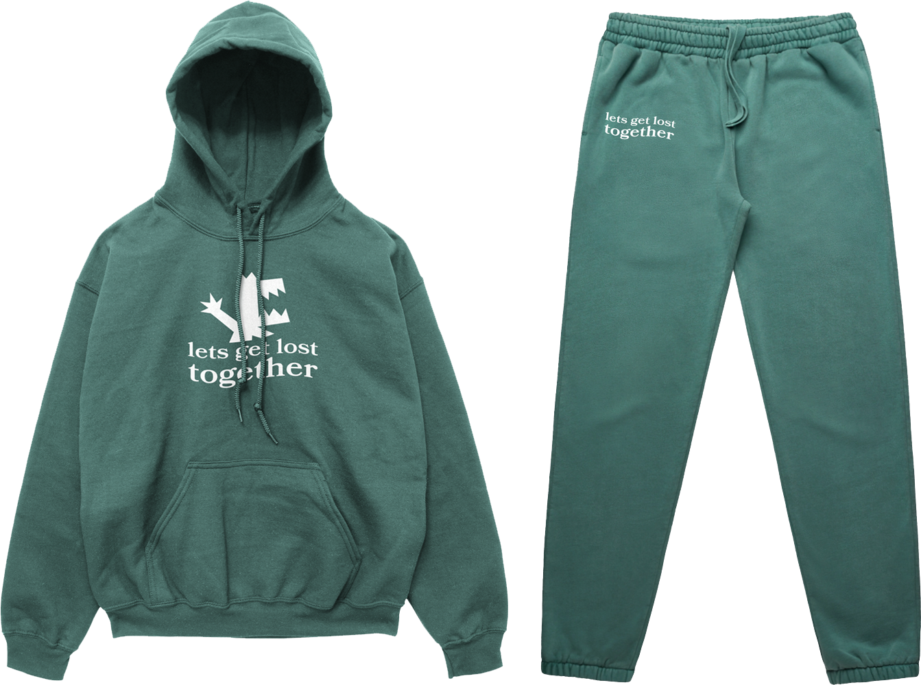
for these designs i definitely wanted to take a more experimental approach to design for kaiju corp. many of these early designs were especially inspired by kids see ghosts and other abstract streetwear. Combined with the messages sean wanted to get across, i also found myself using lyrics from jazz artist chet baker as i felt they also resonated with the kaiju corp creed.


i got through a couple more very experimental designs before both sean and i agreed this was not the direction we wanted this project to go in. after refocusing in on style and message, i went back to the drawing board.

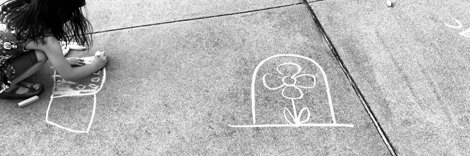
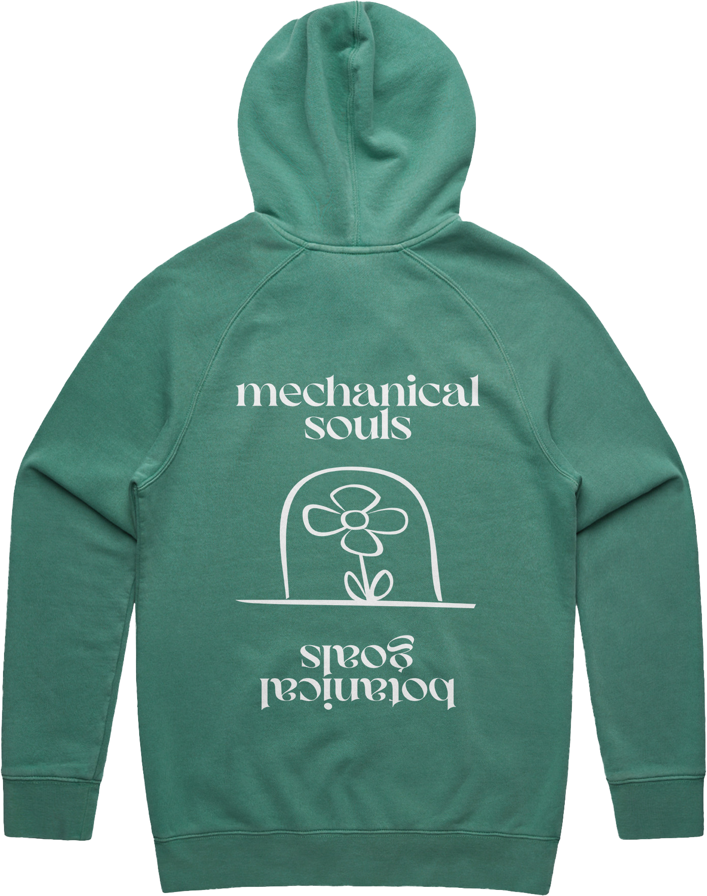
at this point we were almost there, but it was still missing something. sean then asked if would use a chalk drawing of a flower he drew with his children.
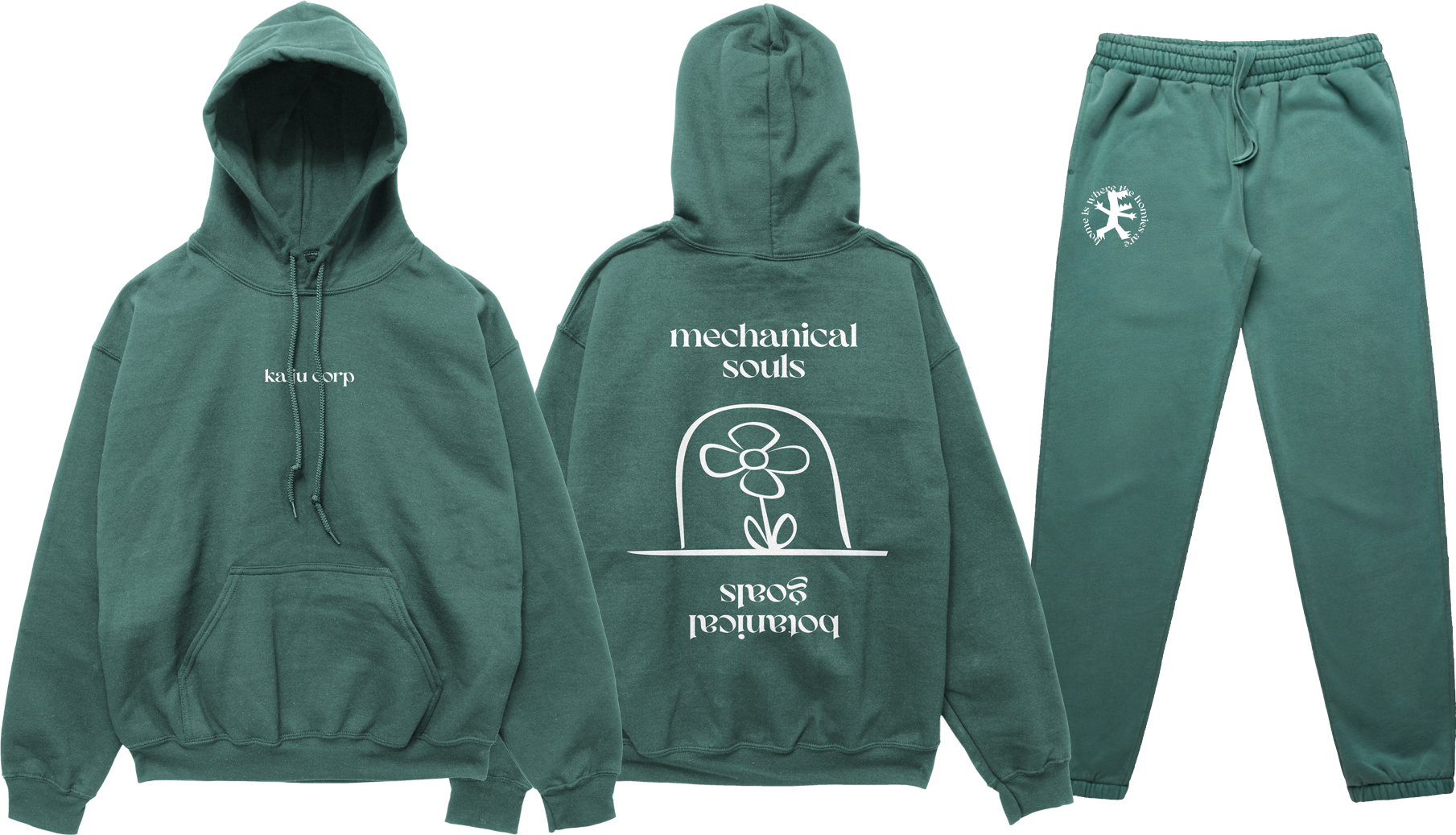
final shirt designs + promotion
gallery
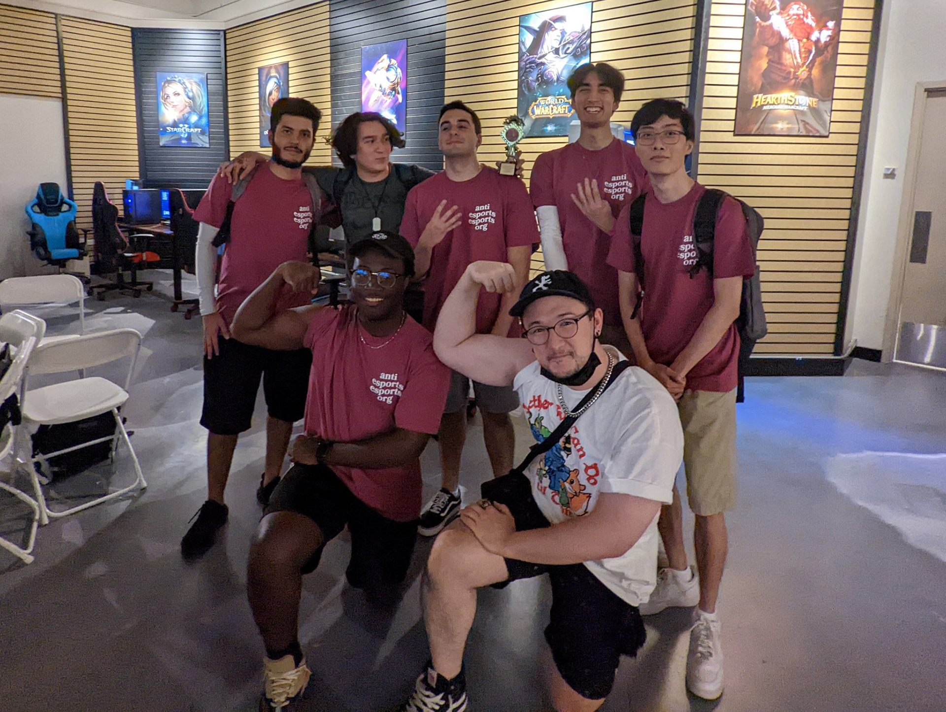
overall, sean and kaiju corp have been an absolute joy to work with. I am so very happy with how every single one of our projects have turned out and always look forward to collaborating with them again.
thank you!